Create user-friendly navigation menu bars with our comprehensive guide. Learn design principles, types, and best practices for an exceptional user experience.
Navigation is a huge priority when you’re designing a website. It needs to be customer-centric or you’ll lose site visitors who might otherwise become customers.
Design principles for navigation menu bars
When designing navigation menu bars, there are a few fundamental design principles that you should keep in mind to ensure that your menu is practical and user-friendly.
Clarity
- Use clear and concise language: Your menu items should be easily understandable to all users. Use simple, straightforward language to label your menu items.
- Avoid jargon and technical terms: Unless you’re designing a menu for a technical or specialized audience, avoid using technical jargon or terms that might be unfamiliar to your users.
- Make it easy to understand for all users: Design your menu assuming your users have varying degrees of familiarity with your website or application. Make it easy for everyone to understand and navigate.
Consistency
- Use consistent design and layout: Your navigation menu should have a consistent design and layout across all pages of your website or application. This helps users know where to find the menu and what to expect when they click on it.
- Keep the menu items in a logical order: Arrange your menu items in a logical and intuitive order. For example, if you’re designing a menu for an e-commerce site, you might want to arrange your items by category (e.g., “Women’s Clothing,” “Men’s Clothing,” “Accessories,” etc.).
- Ensure the menu is accessible from all pages: Make sure your menu is easy to access from all pages of your website or application. Users should be able to find it quickly and easily, no matter where they are on your site.
Usability
- Use appropriate font size and type: Choose an easy-to-read font with a clear hierarchy of headings and subheadings. Use a font size that is legible on all devices.
- Use appropriate colors for text and background: Make sure there is enough contrast between the text and background colors. This makes it easier for users to read and navigate your menu.
- Ensure the menu is responsive to different devices: Your menu should be responsive to different devices, including desktops, laptops, tablets, and smartphones. Test your menu on various devices to ensure it’s easy to use and navigate.
Types of navigation menu bars
Choosing the right menu type that fits your website or application is important when designing your navigation menu bar. Here are the three most common types of navigation menu bars:
Horizontal menu bars

A horizontal menu bar is typically placed at the top of the page and displays menu items horizontally across the screen. Here are some benefits and drawbacks of using a horizontal menu bar:
Benefits:
- Easy to find and use: Users are familiar with this menu type, so it’s easy to find and use.
- Fits well with wider screens: A horizontal menu bar is a good choice if you have many menu items or want to display them in a single row across the top of the screen.
Drawbacks:
- Limited space: A horizontal menu bar can take up a lot of space on the screen, which can be a problem on smaller devices.
- Limited number of menu items: Because of space limitations, a horizontal menu bar may not be the best choice if you have a large number of menu items.
Best use cases:
- Websites or applications with a limited number of menu items.
- Websites or applications with wider screens, where horizontal space is not an issue.
Vertical menu bars

A vertical menu bar is typically placed on the left or right side of the screen and displays menu items vertically. Here are some benefits and drawbacks of using a vertical menu bar:
Benefits:
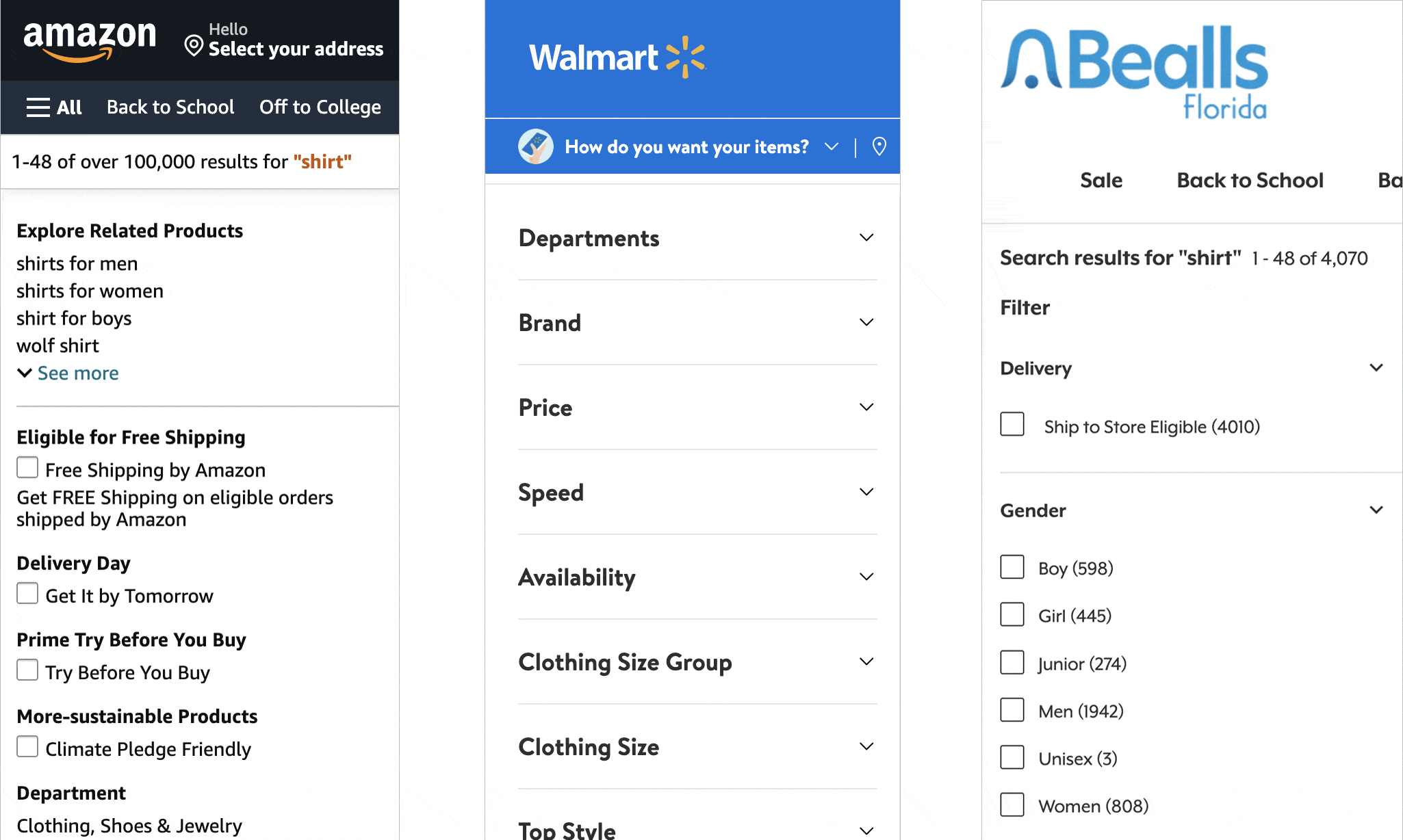
- Saves space: A vertical menu bar takes up less horizontal space than a horizontal menu bar, making it a good choice for smaller screens.
- Allows for more menu items: A vertical menu bar can be longer than a horizontal menu bar to accommodate more menu items.
Drawbacks:
- Can be less intuitive: Users may need to be more familiar with a vertical menu bar, so it may be less intuitive to use.
- Can be overwhelming: A long vertical menu bar can be overwhelming to users, so it’s important to design it in a way that is easy to navigate.
Best use cases:
- Websites or applications with a large number of menu items.
- Websites or applications with smaller screens, where horizontal space is limited.
Hamburger menu bars

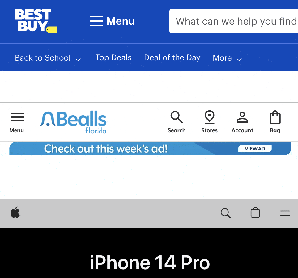
A hamburger menu bar is a type of menu that is represented by a small icon with three horizontal lines stacked on top of each other. When users click on the icon, the menu items appear. Here are some benefits and drawbacks of using a hamburger menu bar:
Benefits:
- Saves space: Like a vertical menu bar, a hamburger menu bar takes up less horizontal space than a horizontal menu bar, making it a good choice for smaller screens.
- Allows for many menu items: Because the menu items are hidden behind the hamburger icon, a hamburger menu bar can accommodate many menu items without cluttering the screen.
Drawbacks:
- Can be less intuitive: Some users may not be familiar with the hamburger menu icon, so it may be less intuitive to use.
- Can be hidden: Because the menu items are hidden behind the hamburger icon, users may not be aware of all the available options.
Best use cases:
- Websites or applications with a large number of menu items that need to be hidden to save space.
- Websites or applications with smaller screens, where horizontal space is limited.
How to write navigation menu bar content
The content of your navigation menu bar is just as important as its design. Here are some tips for writing effective navigation menu bar content:
- Keep it simple and concise: The language you use in your menu items should be simple and easy to understand. Avoid using technical terms or jargon that may confuse your users.
- Use familiar language: Use words that your users are familiar with.
- Highlight important pages: Place important pages, such as “Contact Us” or “About Us,” in a prominent location in your menu.
- Avoid clutter: Include only a few menu items in your primary navigation menu bar.
Best practices for navigation menu bars
While there are many different design options for navigation menu bars, there are also some general best practices to remember.
Here are some tips for creating effective navigation menu bars:
- Keep the menu items to a minimum: Having too many menu items can be overwhelming for users. Keep the number of menu items to a minimum to make it easier for users to find what they want.
- Use descriptive and meaningful labels: Each menu item should have a clear and concise label that accurately describes the content it leads to. Avoid using vague labels like “Miscellaneous” or “Other.”
- Test the menu with real users: User testing can help identify any issues with the navigation menu bar before it goes live. Consider conducting usability testing to get feedback from actual users on the design and layout of the menu.
- Analyze the data and make changes accordingly: Once the navigation menu bar is live, use analytics tools to track user behavior and identify any improvement areas. Make changes to the menu as necessary based on this data.
- Update the menu regularly: Keeping the navigation menu bar up-to-date with the latest content and design trends is important for maintaining a positive user experience. Periodically review and update the menu to ensure it remains practical and relevant.
Design Savvy with Gaby
When it comes to navigation or menu bars, there’s a world of possibilities. What works best for desktop may not work for mobile. But with responsive design, we simplify the challenge and ensure seamless experiences across devices. At SEO Advantage, we create user-friendly navigation that adapts effortlessly to different platforms.
Now that you know the basic of designing navigation menus, let’s jump in real quick on what NOT to do:
- A sea of links: Forcing visitors to sift through an overwhelming number of links is a surefire way to waste their time and create unnecessary friction. Streamlining navigation is critical to providing a seamless and stress-free user experience.
- Neglecting mobile: In today’s mobile-driven world, responsive design is the norm. However, we still come across older and outdated websites that fail to adapt to different screen sizes. This neglect reflects a lack of concern from site owners, which can harm their online presence. Investing time in updating and optimizing your website for mobile is crucial for reaching and engaging with your audience effectively.
- Overwhelming content: Long and rambling texts can quickly overwhelm users and hinder their ability to digest information efficiently. Unfortunately, we often encounter spammy SEO practices where location menus for attorneys or contractors, for example, become an exhaustive list of repetitive phrases. Such content overload becomes tiresome and diminishes the user experience.
- Excessive interactive elements: Overusing flyouts, drop-downs, and hover effects may seem appealing for desktop users, but it can create a nightmare for mobile visitors. Mobile navigation should be intuitive and user-friendly, and an excess of interactive elements can make it difficult for users to navigate seamlessly on smaller screens.
By addressing these common pitfalls, we can create a more user-friendly web experience, ensuring that visitors can easily find what they need and navigate your website with ease.
Final thoughts
An effective navigation menu bar is crucial for creating a positive user experience on your website. By following the design principles, understanding the different types of navigation menu bars, and implementing best practices for writing and testing the menu, you can create a user-friendly and effective navigation menu bar that helps users find the content they need quickly and easily.
Remember to keep the menu items to a minimum, use descriptive and meaningful labels, test the menu with real users, analyze the data, and update the menu regularly to ensure its effectiveness.
With these tips and best practices, you can create a navigation menu bar that enhances your website’s usability and improves your users’ overall experience.